WeatherBug
Tools: Sketch, Zeplin, InvisionIn 2016 I worked extensively with Weatherbug CIO and developers on redesigning their web based weather app used by hundreds of thousands of people every month.

In 2016 I worked extensively with Weatherbug CIO and developers on redesigning their web based weather app used by hundreds of thousands of people every month.
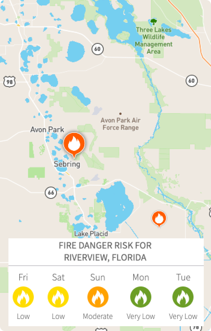
I led the User Experience and User Interface Design for the web app portion of this project. My role included establishing design direction, creating mockups and wireframes, as well as building prototypes. Weatherbug was largely responsible for testing my designs with actual users and would report back with their findings. This meant rapid design iteration. I also built prototypes to convey interaction design when needed. For example, when designing how an interactive weather map could be used, a static mockup was not enough, instead an animation was built.
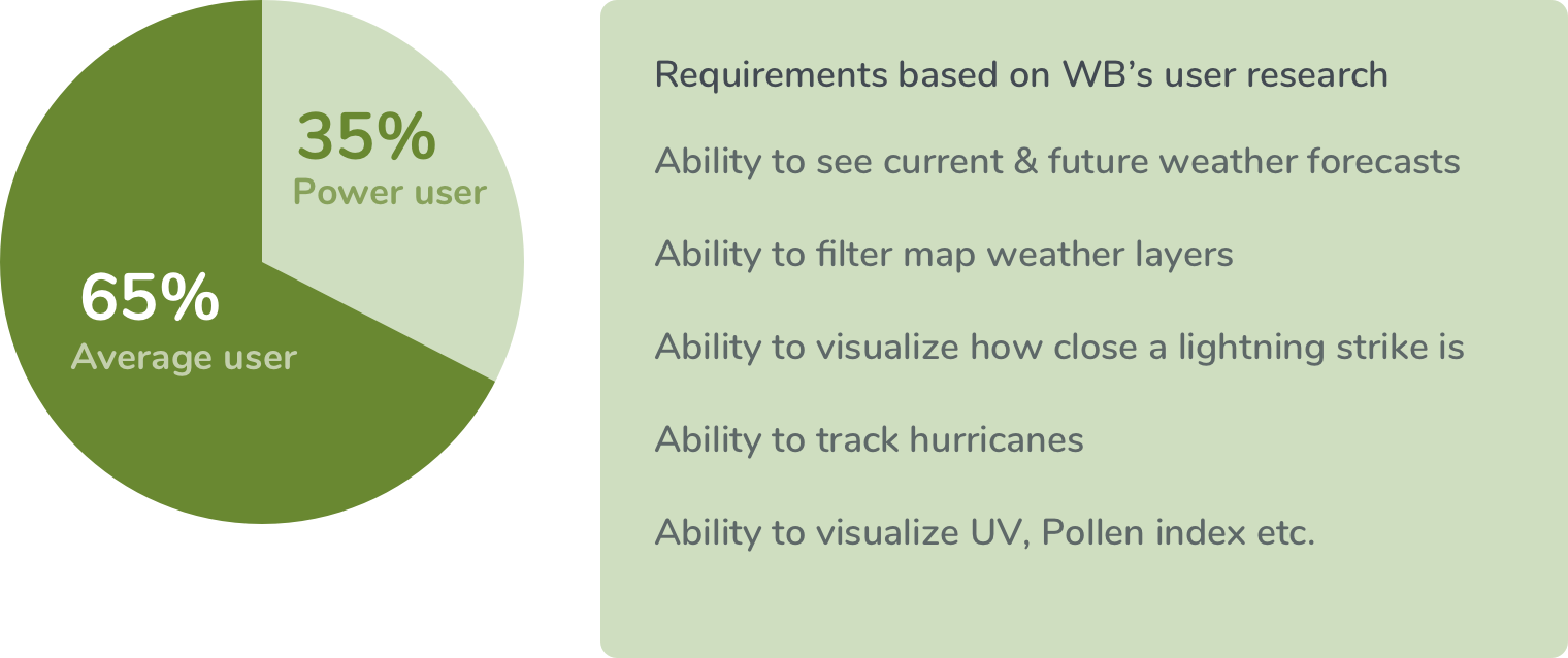
I worked with Weatherbug for about a year and a half on their web app. I took multiple trips to visit their on-site campus so that I could work directly along side their development team. This also gave me the opportunity to explain my designs to stakeholders in person. I was informed by the WB team that they had created two personas to categorize their users: "Power users" and "Average users." Weatherbug had an immense amount of weather data to share with its users and it was important the design conveyed this information in the clearest way possible.
There were many problems to define in this case. For example, "users aren't understanding how to access location specific weather, users need to be able to favorite locations, users cannot easily track storms, users need to see how close a lightning strike or severe weather alert is to their location." All of these specific user problems needed clearly defined stories that translated into simple designs.
There was not one specific set of user tests with a compiled list of results but rather small user tests with small bits of results over a long period of time. This meant the design of the app was portioned into sprints and iterated upon over the course of a year and half. We learned how the personas interacted with the designs. We understood more clearly that the site would benefit from a "drill down" approach to presenting data. For example, the home page summarizes all of the most important weather for your location in one spot. The hierarchy of this information was based on user feedback. Then, the ability to drill down to gather more data is available to Power users.
My approach to solving these design problems first began in establishing a clear design system. I touch on how I do that in a bit more detail in my Amgen Case Study so I'll skip that portion here. In summary, once design patterns and styles are established and agreed upon, it's easier to build designs more quickly and efficiently. In this case we were able to focus the majority of our design efforts towards using these components to create a great user experience. Nearly every design contained some form of "drill down" information where a user could see, quickly, the high level data they came for but still click the UI object for more detailed data.
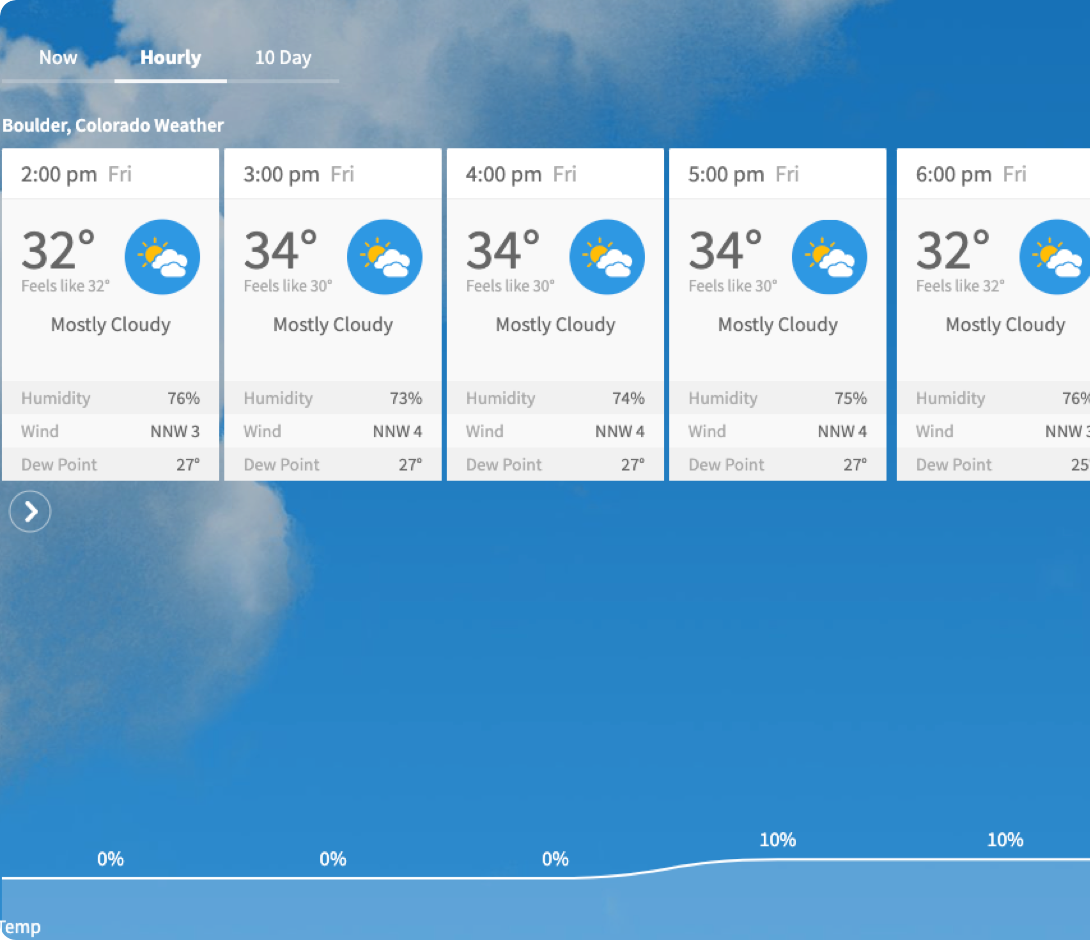
My process for this project meant I spent a lot of time in Sketch creating mockups. I used Principal app to animate my designs when needed. A great example of this was the weather map radar layers you can toggle on and off. To convey exactly how this worked I needed to animate it or at least build a prototype. Over time you develop a cadence with your developer(s) and they begin to predict how your designs will work and even offer design suggestions of their own. In this case the quick fade-in and fade-out of menu items was the developers suggestion.
As with my other projects, design was iterative and based on user feedback. "User's need to be able to access the UV and pollen index from the home screen" meant either creating a new UI component based on existing styles or re-using a component. Sometimes I sketch on my iPad or on paper but usually once a design system is in place it's quicker to go directly into Sketch and start designing the idea with a lo-fi mockup.
This project was very fun for many reasons. I had a lot of creative freedom and was encouraged to push the design further and further. I had the opportunity to design UI that I enjoy using like weather map radars and a hurricane tracker. I also loved the idea of creating a weather app that was custom to the weather you were experiencing in real-time. Meaning the background gradient would update to a hue that matched your current weather and the fairly neutral UI on top of this gradient would still look beautiful. (A WB org change would ultimately change this gradient and color scheme to actual photo backgrounds after the project ended.)