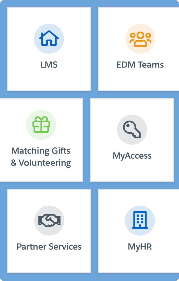
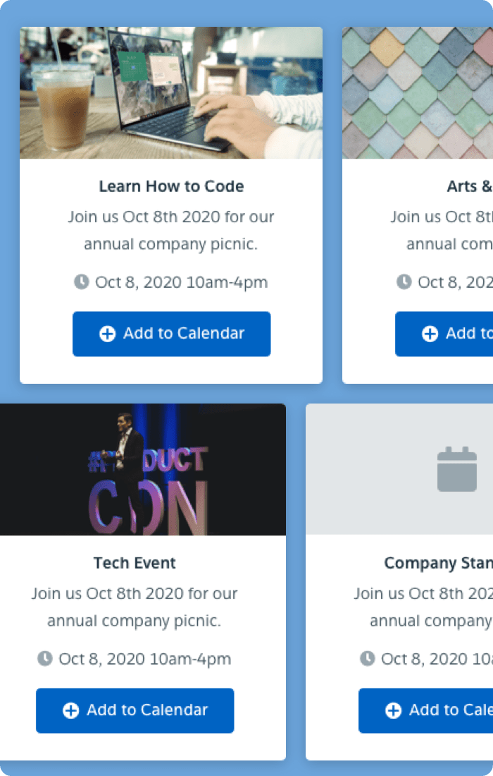
In 2020 I began UI/UX design work on the MyAmgen portal for over 40,000 Amgen employees. This internal portal is used for training, employee education, resource management, events, apps, sharing ideas, and information about on-site amenities.
I was brought on as the lead designer for the MyAmgen team. I was fortunate enough to have two internal designers to collaborate with on any designs I created, although they were not directly a part of my team. My role included creating the best possible user experience design based on the current "out of the box" Salesforce site. This meant learning the Salesforce Lightning Design System or SLDS (Salesforce’s design framework) and familiarizing myself with the current web portal. Nearly every page of the portal was in need of a redesign. In addition to that a design system, custom to Amgen, was needed.
I spent the majority of my time, initially, learning about SLDS, it’s components and rules. Once I felt well established I audited the current version of MyAmgen. My method of auditing an application like this includes applying my existing UI/UX knowledge but also making sure not to fill in unknowns with my own assumptions. I needed to better understand the expectations for the existing design and it's end users. I began asking questions about the placement of UI objects and components. With a list of questions and general design improvements listed out I met with the stakeholders to present my findings. Some improvements were put into the development cycle immediately.
In addition to this I met with my in-house design team and discussed usability reviews to test the current design. We spent weeks mapping out and planning these reviews to gather as much feedback as possible. We used apps like Quip and Miro to format what questions we would ask. I developed prototypes in Invision that aligned with these questions. We hand selected 12 users across the world that fit the personas we wanted to test. These personas were based on previous UX data gathered by the team. In short, the personas included everything from the most portal saavy users to those who had just been hired and had no portal experience yet.
The results were conclusive on many fronts. While I cannot go into exact detail about any design changes, it was clear what users valued on their home page and the subsequent pages we tested. We gained key insights into how users expected certain UI components like “Search” to behave. Usability testing once again proves to be the most important facet of the design process. We not only gained insight into our original questions but learned key information into user's behavior that prompted design iteration. All feedback was properly filtered, grouped, and implemented by myself in Sketch and promptly updated to Zeplin for stakeholder review.
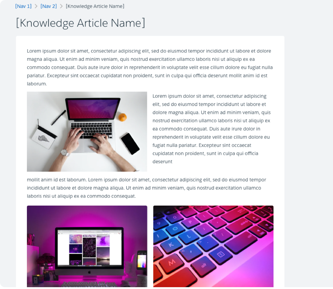
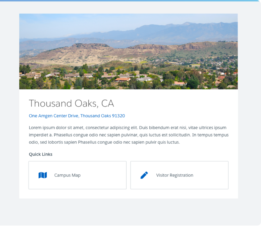
My time on this project extended from the initial UI/UX improvements push and usability testing. The following months included the addition of hundreds of pages of new content that needed design direction and rules. Design rules were extremely important for ensuring this content looked uniform and met user's expectations. Defining a design guide with rules meant all of this content could be templated which aided in the scaling of the portal. The design guide was 22 pages and included every componenet found in the app. By defining nuances like, when to use what color, verbage for different buttons and links, and defined page patterns we can ensure a simple and consistent user experience.
My process on this project was largely iterative. Every design required multiple stakeholder approvals. A tech review, manager or main stakeholder review, and design team review. This meant my Sketch designs spent many cycles exporting to Zeplin, annotating to explain my design, getting feedback, and revising.
I like to work quickly and iterate as ideas come to my head. When coming up with page patterns I took the content provided and asked stakeholders how they envisioned the information hierarchy. This saves unnecessary back and forth because expectations are defined up front. If I began designing a component that was already in the design guide, great, I can drag and drop it in. If the pattern didn't already exist I made sure it needed to be created and once that was decided, added it to the design guide.
Once the design was "done" on my end I exported to zeplin, explained the design via email, zeplin note, or on a webex screen share and received feedback. As mentioned previously, there were many stakeholders in this process so there were many trips back into Sketch to add, edit, or remove items.

With my extended contract coming to an end I've had time to reflect on the work myself and the team at Amgen put into the MyAmgen portal. We listened to every piece of user feedback and dissected the data to ensure any change being made was always aligning with our goal, "is this the best user experience possible?" I don't believe any design is ever "finished" or completed but I do believe the portal experience is much better for the end user now than it was before we began.