Zazn Meditation App

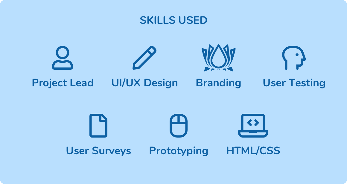
Tools: Sketch, Zeplin, Principal, Invision, Sublime Text

In 2014 I set out to design for anxiety, a problem that more than 3 million Americans are diagnosed with each year. Suffering from anxiety and insomnia myself I knew I wanted a more simple meditation app than what was currently available. This case study summarizes the initial 2014 v1.0 design and the subsequent 2019 v2.0 redesign.

My Role

Creating my own app meant building out every aspect of the idea. What would the app look like? What features did it need to have and what features were “nice to have”. What kind of marketing would I do? More importantly, what did other people want in a meditation app? While I set out to build an app for myself, my focus quickly shifted to creating an app other people would love using as well.

Defining the Problem

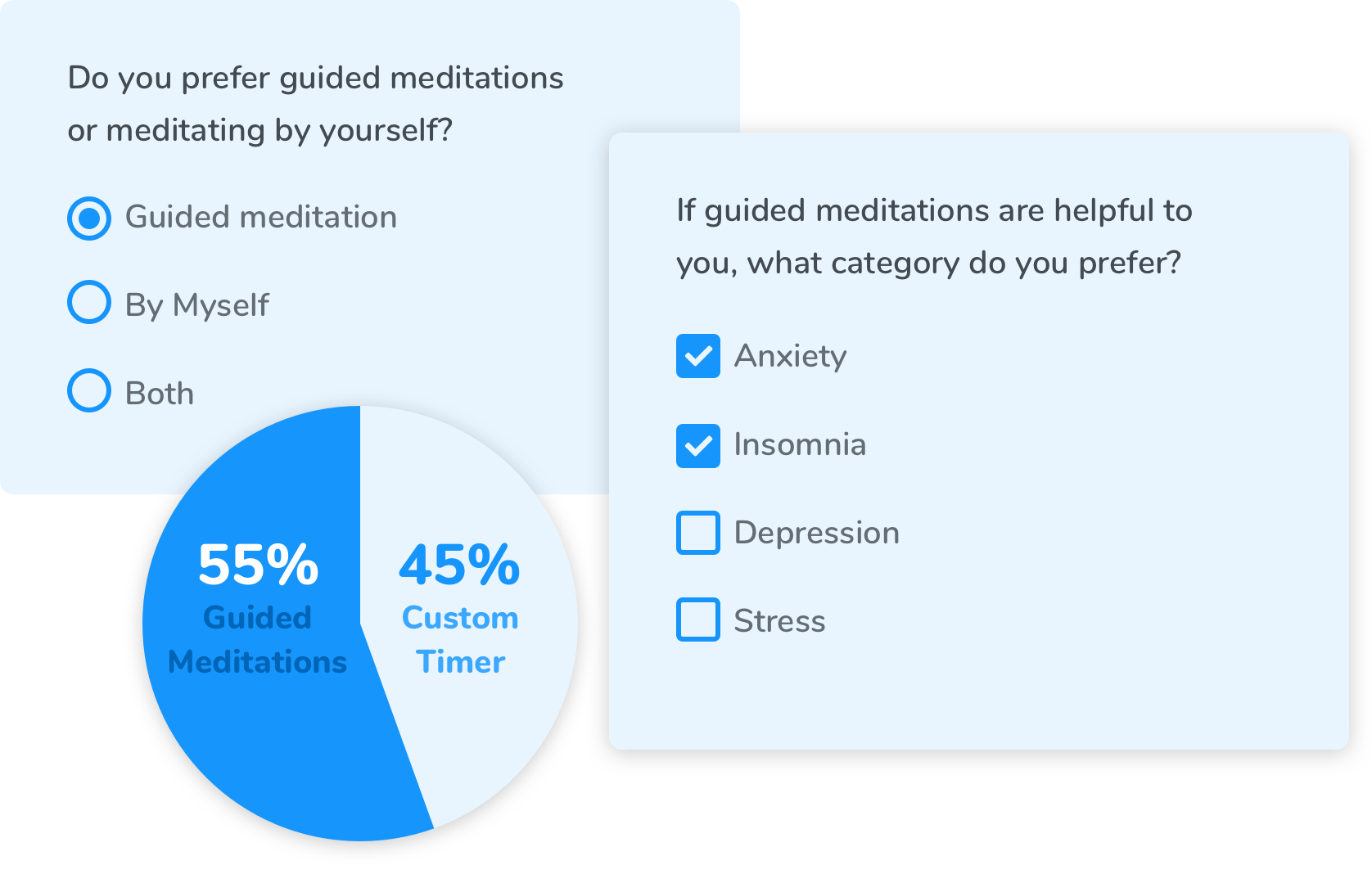
I knew what I wanted in a meditation app but what problem was I really solving for? I began with user surveys using Google Forms. I posted these on popular meditation subreddits to get feedback on what was important to users in a meditation app. I asked what meditation apps they currently used, if any. I asked what they thought could be improved and I learned what areas to focus the app on most heavily.

Analyzing the Results

The results of my surverys were fantastic insight into my target audience. I learned that the current market (in 2014) was flooded with complicated timers and clunky subscription apps that charged more than what most users thought was worth paying. There was also an almost even split between users who wanted to be guided through a meditation via an audio recording and users who simply wanted a timer they could customize the duration of. Reading between the lines here I gathered the more experienced meditators use the timer while new students to the practice preferred to be “taught” how to meditate via recordings. These personas helped me split the app into to section, “guided” and “solo.”

Solving the Problem

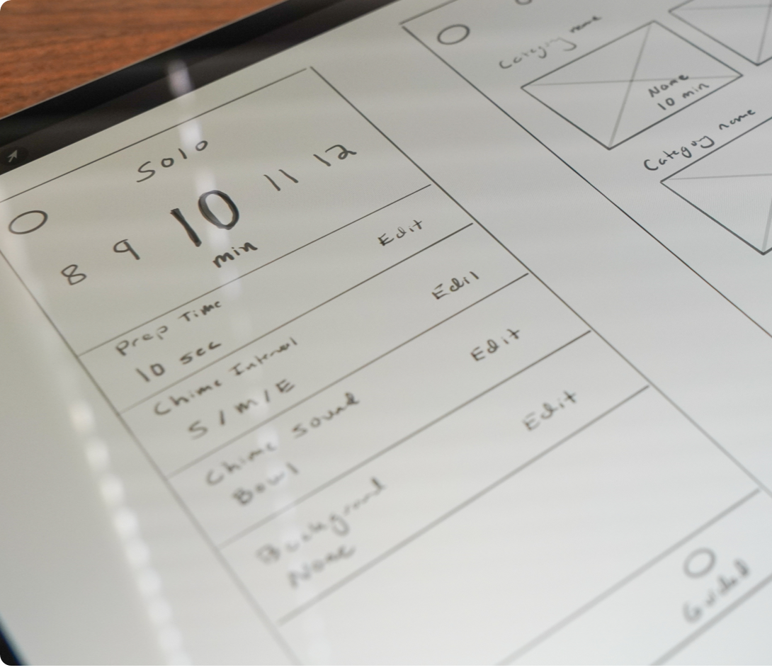
I listed out the requirements gathered from my survey results. I knew about an even split of users wanted customization as well as quality guided audio tracks. These users were willing to pay a small fee for these features. I began sketching ideas given the known framework. This being my first iPhone app also meant familiarizing myself with iOS design standards which acted as the foundation of my UI and UX.

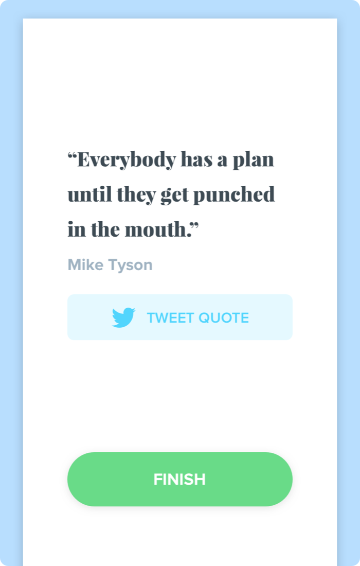
I also saw an opportunity to add something extra to the end of each meditation session. In the app once the meditation ends the user is presented with a unique quote. They have the ability to share this quote on social media and a link to Zazn's social is pre-added. I found some users used this frequently but most did not share on social.

About My Process

Since I acted as the main stakeholder for my project I made all final decisions. I landed on “Zazn” as the name derived from “Zazen” meaning ‘seated meditation.’ The lotus flower logo was simple, symmetrical, and tied into the name of the app perfectly. I built a marketing site at the time using HTML/CSS.

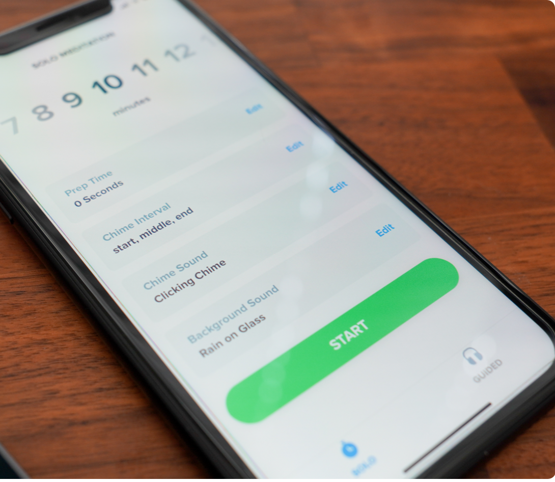
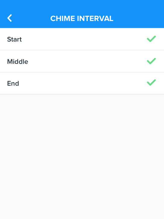
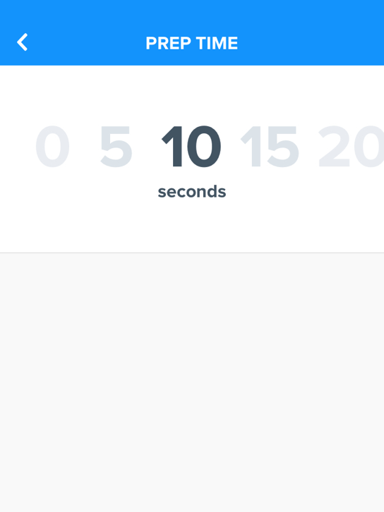
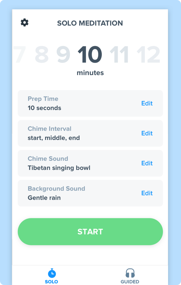
The app itself took about a week of hands on keyboard design work. I like to iterate by working for 1-2 hours and then I step aside and come back with fresh eyes. Once the problems are defined and the solutions are in place I like to design multiple ideas as quickly as they come to my mind. Sometimes I will have 5 or more variations of one screen that I can’t decide on. With Zazn I took a lot of consideration into the “Solo” customizable screen. I learned most users want a quick breakdown of their settings but once set, do not often change them. This summary view I designed made it easy to glance and see what kind of timer you had set with the ability to tweak as needed.
Conclusion

I knew what I wanted in a meditation app but what problems was I really solving for? I began with user surveys using Google Forms. I posted these on popular meditation subreddits to get feedback on what was important to users in a meditation app. I asked what meditation apps they currently used, if any. I asked what they thought could be improved and I learned what areas to focus the app on most heavily.

Back to Case Studies